Legibility in relation to contemporary typography.
Sources
:
Fischer, S.R. (2001). History of writing. Reaktion Books.
A general background of the history of written forms for use in the context of typography essay.
Eisenstein, E.L. (2005). The printing revolution in early modern Europe. Cambridge University Press.
An insight into the history of printing and the arrival of the typeface through necessity.
Phinney, T. (2010) Transitional & modern type families. Graphic Design.
This gives background on the development of typefaces from old-style, into the transitional phase, and finally into modern typefaces.
Mosley, J. (1999). The nymph and the grot: The revival of the sanserif letter. Friends of the St Bride Printing Library.
Background on the increased usage of sans-serif typography.
Clark, B. (2013). Akzidenz-grotesk in a brief history of sans-serifs. Gerrit Rietveld Academie.
Gives some history of a revolutionary sans-serif typeface.
Warde, B. (1930). The crystal goblet, or printing should be invisible. British & Colonial Printer & Stationer.
Argues for the maximum legibility of typography and types position as a tool rather than a piece of art.
Drucker, J. (1994). The visible word: Experimental typography and modern art, 1909-1923. University of Chicago Press.
Covers early design movements and the involvement in typographic art in which typography is used experimentally rather than for legibility.
Bartram, A. (2005). Futurist typography and the liberated text. Yale University Press.
Discusses the use of typography within Futurism to convey a sense of motion and advancement in accordance with the movement's principles.
Haley, A. (2017). It’s about legibility. Monotype Imaging Inc.
Discusses the room for both readable and experimental typography, with legibility being a trait of a typeface rather than a requirement.
White, A. W. (n.d.) Alex White: Design’s function & typography. Graphic Design & Publishing Center. http://www.graphic-design.com/Type/alex_white/design_typography.html [Accessed 17 Apr 2018]
Discusses the requirement for typography to be both readable, as well as interesting and engaging which are both inversely proportional.
Lewis, J. (1963) Typography: Basic principles. Studio Books.
Provides information on the designers position within presenting an author's work through the book design and layout.
Poynor, R. (2003) No more rules: Graphic design and postmodernism. Lawrence King Publishing.
Discusses more experimental typography that has arose in a post-modern era.
White, A. W. (2005) Thinking in type: The practical philosophy of typography. Allworth Press.
Discusses the need for creativity at the expense of legibility to guide the reader.
Boulton, M. (2009) A practical guide to designing for the web. Mark Boulton Design.
Discusses the typographic hierarchy.
Bay-Cheng, S. (2007). Translation, typography, and the avant-garde's impossible text. Theatre Journal, 59(3).
Gives some information on early experimental typography as well as typography in Dada.
Didn't complete practice paragraph - revisit
Tuesday, 17 October 2017
Tuesday, 10 October 2017
Cop task 2
Before we begin on research for our essays it is important to create a visual representation of my ideas relating to the typography so I could find books/articles and websites to investigate further. I needed to consider relevant contexts, concepts and issues which surround the topic. For type and typography I came up with these ideas;
- The theme
- The characteristics of type
- The context it is applied to
- Issues around legibility
- Serif and san serif
- Exploring what makes a typeface unique
Tuesday, 3 October 2017
Exploring the topic
Typography and Type Design - the style and appearance of printed matter - the art or procedure of arranging type or processing data and printing from it. I love the old David Carson Ray Gun designs and the way in which the typography echoes the youthful vibrancy of the Rock and Roll magazine. Glyphs are at times merged into each other to give a flow to the otherwise blocky and isolated san serif forms. Size and case are also manipulated on the left as if the letters are dancing.

Advertising and Public Awareness - Advertising designers are the people who create advertising campaigns that are intended to get consumers to buy the ad's featured product. Their role involves researching what is effective for reaching their target customers and developing advertising strategies that can increase sales. Advertisers have always been keen to attach a positive emotion or message to their product in order to sell unhealthy items, showing how subjective are to emotive advertising. Interestingly both adverts use red.


Branding and Logo Design - the promotion of a particular product or company by means of advertising and distinctive design. Logos use multiple components to create a whole image as described by the Gestalt effect. The Fedex logo helps promote positive brand identity via a hidden arrow in the negative space. The simplicity of the WWF bear allows the eye to fill in negative spage and percieve the bear as a whole.


 Editorial Design - relating to the commissioning or preparing of material for publication. 032c uses an anti-graphics style to indicate their discourse with mainstream culture and hint at the content of the publication. Whereas newspaper such as the guardian have a clear structure and hierarchy of information denoting the tone.
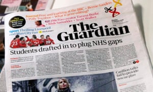
Design for Screen - web design that involves the creation and maintenance of online platforms. Wikipedia is highly informational and features very regimented text with few images, whereas Pitchfork has far more of a image to text ratio due to its need to display various media in an interesting way - also note wiki doesn't need to attract people to click for adds whereas pitchfork does.


Printmaking- the process of making artworks by printing, normally on paper. Printmaking normally covers only the process of creating prints that have an element of originality, rather than just being a photographic reproduction of a painting. Screen and riso printing look fairly similar on the first inspection however the opacity of the ink is completely different and the level of detail varies. Screen printing is fairly quick and consistent if done right.


Subscribe to:
Comments (Atom)
COP3 proposal presentation and feedback
This afternoon we had our cop presentations so I put together this 12 slide presentation to accompany the script I wrote this week. Quickly...

-
Before we begin on research for our essays it is important to create a visual representation of my ideas relating to the typography so I co...
-
Question: The typographic relationship between form and function within the fashion industry I am intrigued by the contemporary rise...
-
 This afternoon we had our cop presentations so I put together this 12 slide presentation to accompany the script I wrote this week. Quickly...